23 Interior Color Trends 2026 You Need to Try Before Everyone Else
You know that moment when your space suddenly feels… off? Nothing major changed, but the colors just don’t hit the same anymore. That’s exactly where a lot of people are right now. The shift into Interior color trends 2026 isn’t about drastic overhauls, it’s about subtle, mood-driven updates that completely change how your home feels without replacing everything you own.
I’ve been noticing this everywhere lately. Softer palettes replacing harsh contrasts, deeper tones showing up in unexpected places, and colors that feel more emotional than just “pretty.” If you’ve been itching to refresh your space but don’t know where to start, this list will give you ideas you can actually use, not just admire.
Let’s get into it.
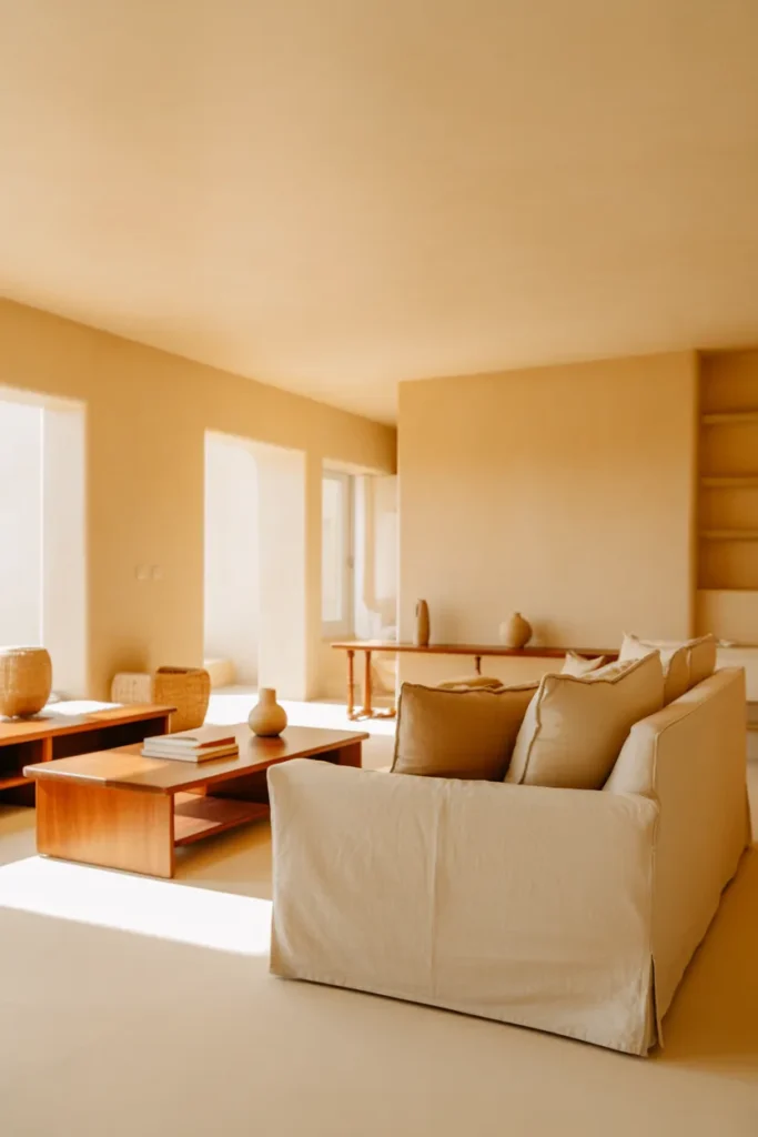
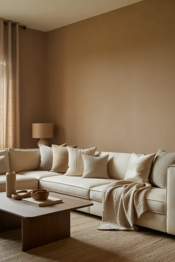
1. Soft Clay Beige Walls That Feel Calm Without Being Boring
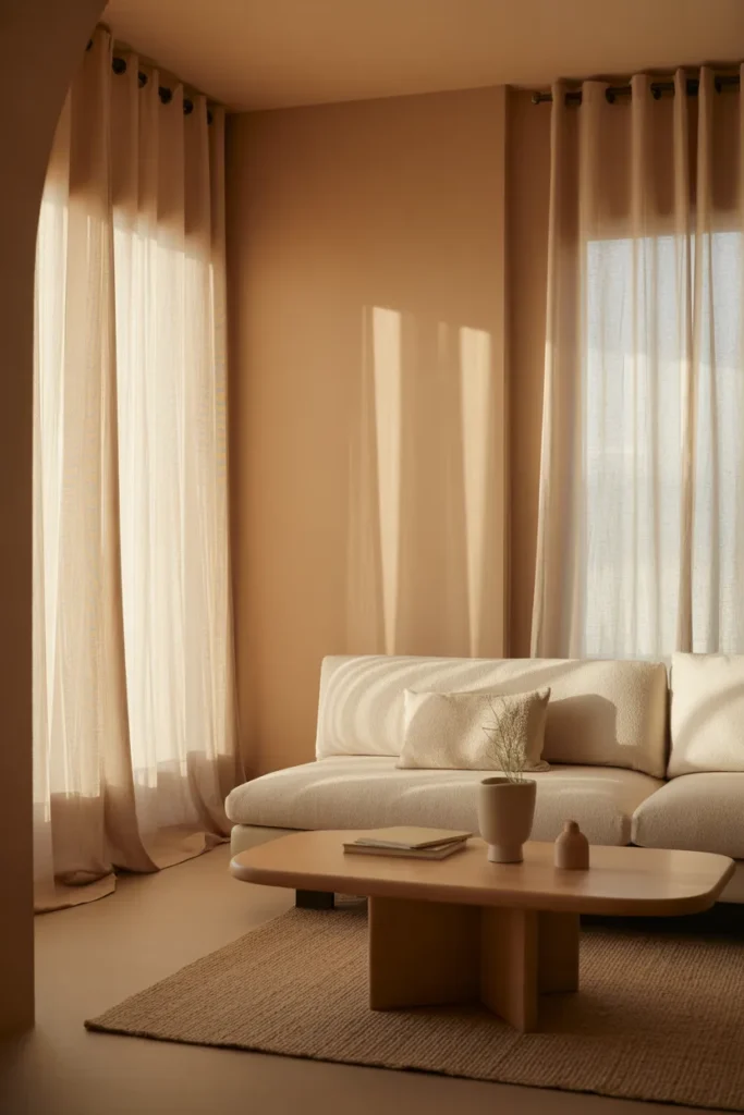
There’s something incredibly grounding about a warm clay beige. Not the flat, lifeless beige from years ago, but a slightly rosy, sun-baked tone that feels like late afternoon light hitting your walls.
This color works beautifully in living rooms where natural light filters through sheer curtains. Pair it with a low, cream sofa and a wooden coffee table placed slightly off-center for that relaxed, lived-in vibe. It’s especially good if your room gets a lot of sunlight, as the tone shifts subtly throughout the day.
Best Working Ideas
- Use matte clay beige on walls with white ceilings for contrast
- Add linen curtains in off-white to soften the look
- Place a warm wood console against the wall
- Use textured cushions instead of bold patterns
2. Moody Olive Green Bedrooms That Feel Like a Retreat
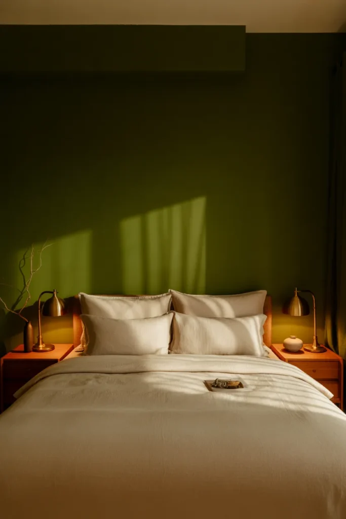
If your bedroom still feels too bright or busy, olive green might be the reset you didn’t know you needed. It has this cocooning effect that makes you want to stay in bed just a little longer.
Paint the wall behind your bed in a deep olive shade and keep the rest neutral. Add brass bedside lamps with warm bulbs placed slightly lower than eye level so the light feels intimate, not harsh.
Best Working Ideas
- Pair olive walls with cream bedding
- Use gold or brass accents for contrast
- Add a woven rug under the bed
- Keep decor minimal to avoid heaviness
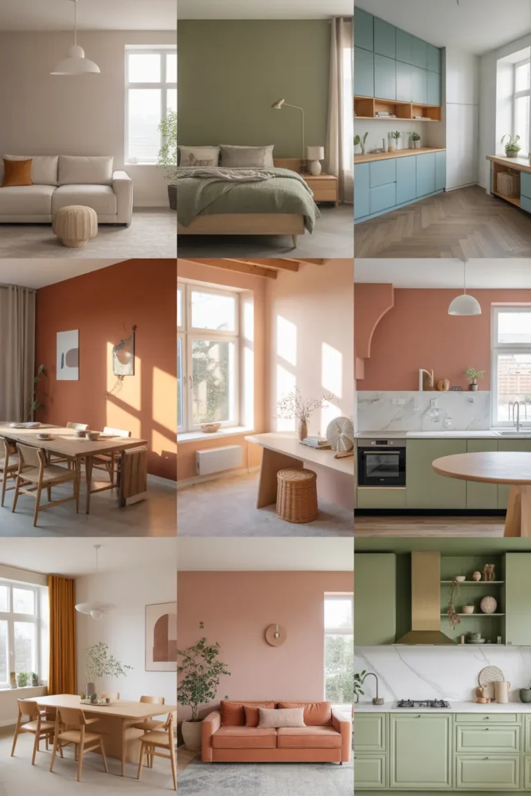
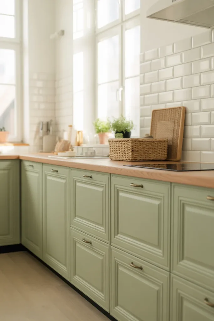
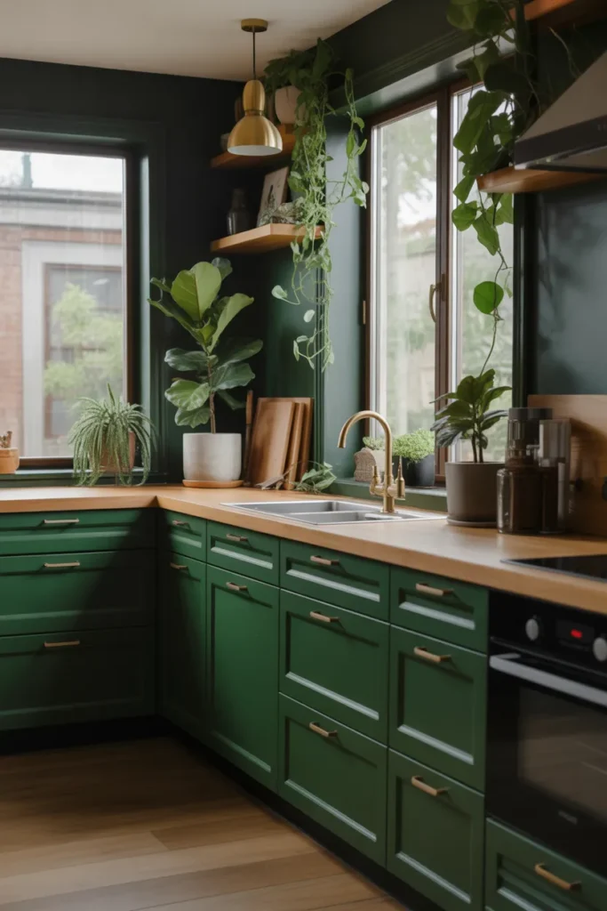
3. Dusty Blue Kitchens That Feel Fresh Yet Relaxed
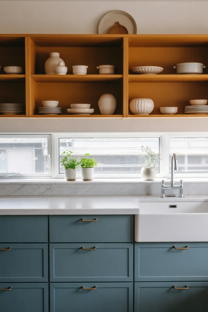
Blue kitchens aren’t new, but dusty blue is having a quiet moment. It’s softer than navy, less obvious than pastel, and fits right into modern homes.
Imagine lower cabinets in dusty blue with a white countertop and open wooden shelves above. Place a small plant near the sink where sunlight hits in the morning, it brings the whole setup to life.
Best Working Ideas
- Use dusty blue on cabinets, not walls
- Pair with brass handles for warmth
- Keep backsplash simple and light
- Add greenery near windows
4. Warm Terracotta Accents That Instantly Add Depth
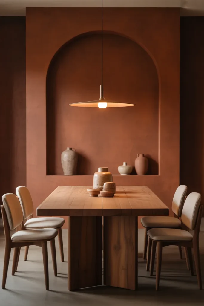
Here’s the thing, terracotta is no longer just for pots. It’s showing up in cushions, accent walls, even lamps.
A terracotta accent wall behind a dining table can completely change the mood of your space. Especially if you hang a simple pendant light right above the table, letting the warm tones bounce around in the evening.
Best Working Ideas
- Use terracotta in small doses if unsure
- Pair with neutral furniture
- Add ceramic decor pieces
- Works best in dining and living areas
5. Butter Yellow Corners That Feel Quietly Cheerful
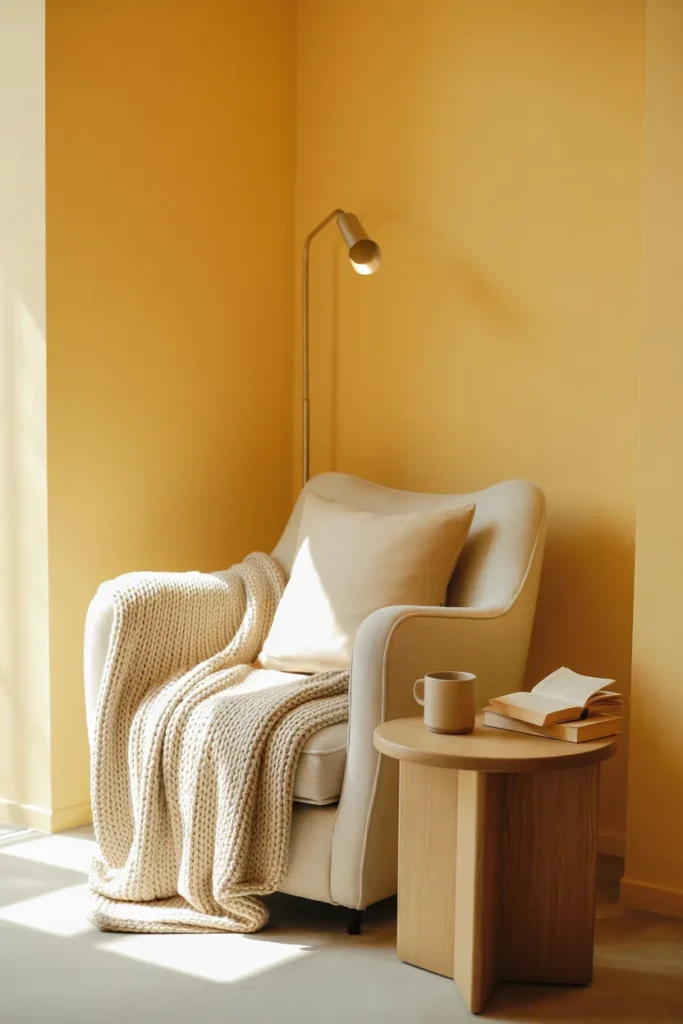
Not bright yellow. Not pastel either. Butter yellow sits right in between and feels surprisingly sophisticated.
Try this in a reading corner with a soft armchair and a floor lamp positioned slightly behind the chair. The color reflects light beautifully and makes even small spaces feel welcoming.
Best Working Ideas
- Paint a single corner instead of full walls
- Pair with light wood furniture
- Add soft textiles like throws
- Keep surrounding colors neutral
6. Charcoal Gray That Feels Modern, Not Cold
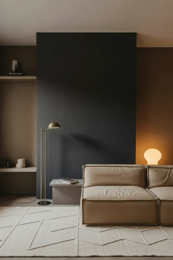
Charcoal done right feels sleek, not depressing. The trick is balance.
Use charcoal on one feature wall in a living room and offset it with a light rug and neutral sofa placed directly in front. Add layered lighting, a floor lamp in one corner and a table lamp on the opposite side.
Best Working Ideas
- Use warm lighting to soften gray
- Pair with beige or cream furniture
- Add metallic accents sparingly
- Avoid using it in small, dark rooms
7. Soft Sage Green That Feels Airy and Light
Sage green continues to dominate Interior color trends 2026, and honestly, it’s not going anywhere soon.
It works beautifully in kitchens, bedrooms, even bathrooms. Especially when paired with white tiles and natural textures like rattan or linen.
Best Working Ideas
- Use sage on cabinets or walls
- Pair with white and wood tones
- Add woven baskets for texture
- Keep lighting soft and natural
8. Blush Pink Living Rooms That Feel Grown-Up
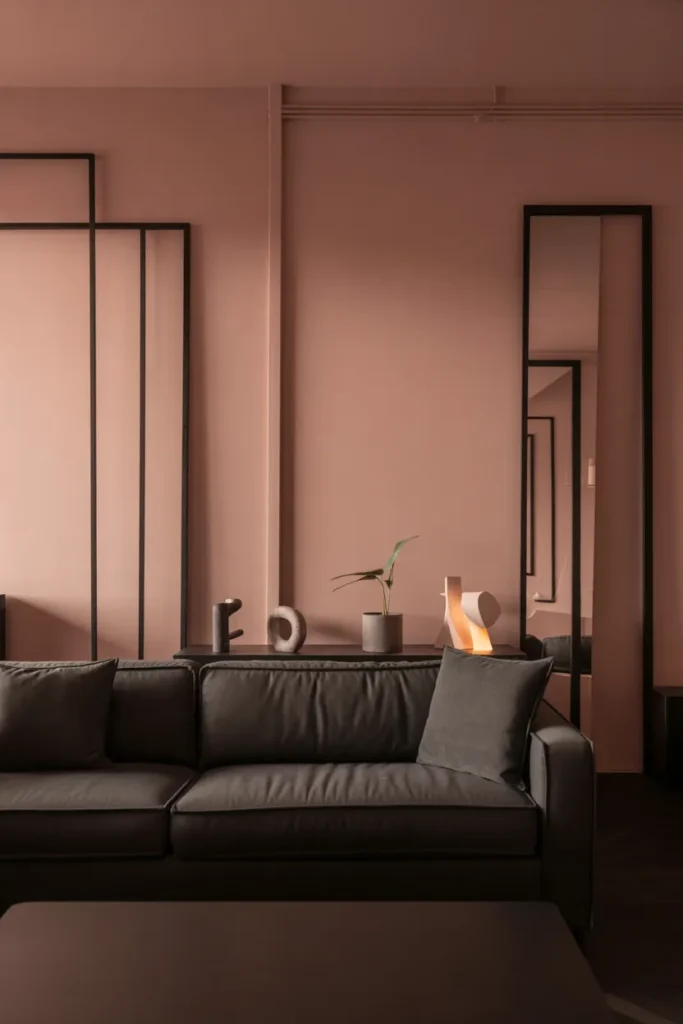
Blush isn’t childish anymore. When done right, it feels soft and elegant.
Use blush on walls with darker furniture like a deep brown or muted gray sofa. Add black accents in frames or lighting fixtures to ground the softness.
Best Working Ideas
- Keep blush tones muted
- Add contrast with darker decor
- Use minimal patterns
- Works well with gold accents
9. Deep Navy Dining Rooms That Feel Dramatic
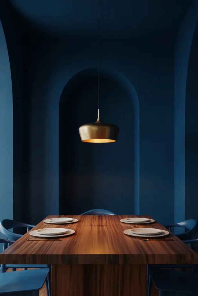
Want your dining area to feel more intentional? Navy is your answer.
Paint all walls in a rich navy and add a wooden dining table in the center. Hang a statement light directly above, slightly lower than usual, to create a cozy, intimate feel.
Best Working Ideas
- Use navy in well-lit rooms
- Pair with warm wood furniture
- Add white plates or decor for contrast
- Use soft lighting
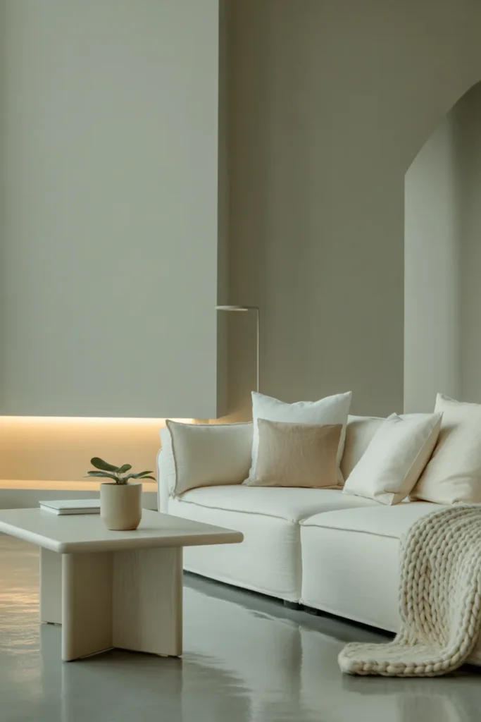
10. Creamy White That Feels Soft, Not Sterile
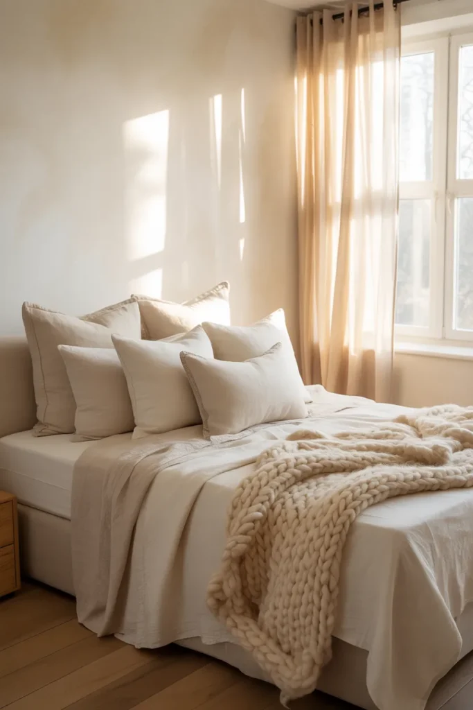
White is evolving. The stark, cold white is fading out, replaced by creamy tones that feel softer.
Use this in bedrooms with layered textiles. Think soft bedding, curtains, and rugs that create depth without adding color.
Best Working Ideas
- Choose warm undertone whites
- Layer textures for interest
- Add subtle beige accents
- Avoid mixing too many shades
11. Muted Lavender That Feels Unexpectedly Calm
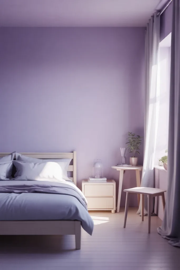
Lavender isn’t just for kids’ rooms anymore. A muted, grayish lavender can feel incredibly soothing.
Try it in a bedroom or even a small home office. Especially near a window where natural light softens the tone throughout the day.
Best Working Ideas
- Pair with white or gray furniture
- Use minimal decor
- Add soft lighting
- Keep it subtle, not bright
12. Earthy Brown Walls That Feel Rich and Cozy
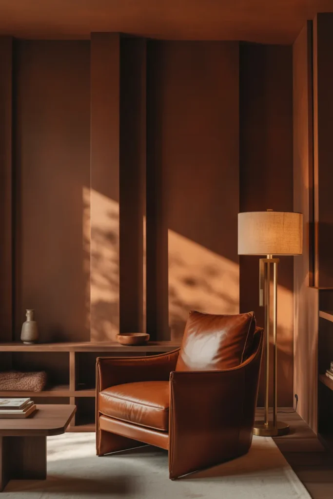
Dark brown is quietly making a comeback, and it’s stunning.
Use it in a study or living room with leather seating and warm lighting. Place a floor lamp beside the sofa so the light hits the wall at an angle, creating depth.
Best Working Ideas
- Use in larger spaces
- Pair with lighter furniture
- Add wood textures
- Keep decor minimal
13. Pale Peach That Feels Soft and Fresh
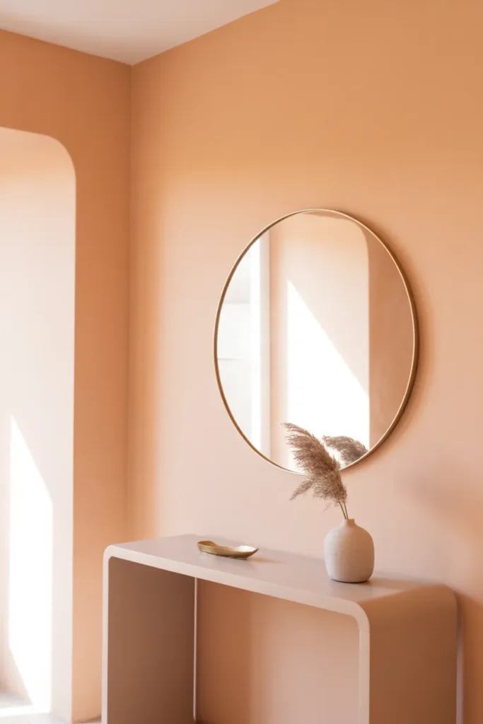
Pale peach brings warmth without being overpowering. It’s perfect for spaces that feel a bit flat.
Try it in a hallway or entry area. Add a mirror across from a light source so the color reflects and brightens the space.
Best Working Ideas
- Use in small areas
- Pair with white or beige
- Add simple decor
- Keep lighting bright
14. Forest Green That Feels Bold and Grounded
If olive feels too soft, go deeper with forest green.
It works beautifully on cabinets or accent walls. Especially in rooms with lots of natural textures like wood or stone.
Best Working Ideas
- Pair with brass or gold
- Use in well-lit areas
- Add plants for cohesion
- Keep surrounding colors light
15. Soft Gray-Blue That Feels Timeless
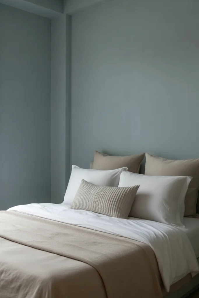
This one sits right between gray and blue, and that’s exactly why it works.
Use it in bedrooms or living spaces where you want a calm, neutral feel with just a hint of color.
Best Working Ideas
- Pair with white furniture
- Add soft textiles
- Use layered lighting
- Keep decor minimal
16. Warm Sand Tones That Feel Natural and Relaxed
Sand tones feel effortless. Not too beige, not too yellow.
Perfect for open spaces where you want everything to feel connected. Use consistent tones across walls and furniture for a cohesive look.
Best Working Ideas
- Use across multiple surfaces
- Pair with wood accents
- Add linen textures
- Keep color palette simple
17. Rich Burgundy That Feels Luxurious
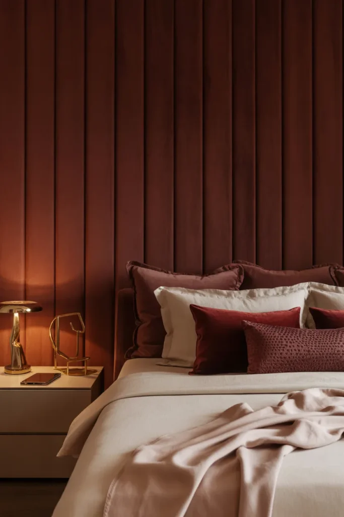
Burgundy brings depth without going too dark.
Use it in dining rooms or bedrooms with soft lighting. Add velvet cushions or curtains to enhance the richness.
Best Working Ideas
- Pair with gold accents
- Use in smaller doses
- Add soft textures
- Keep balance with lighter tones
18. Light Mint Green That Feels Fresh
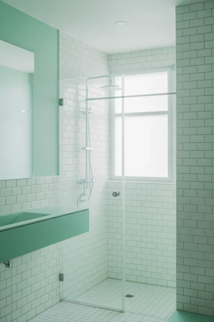
Mint is making a comeback but in a softer, more muted way.
Great for bathrooms or kitchens. Especially when paired with white tiles and simple fixtures.
Best Working Ideas
- Use in small spaces
- Pair with white
- Add minimal decor
- Keep it light and airy
19. Warm Taupe That Feels Effortlessly Stylish
Taupe sits between gray and beige, and honestly, it’s one of the easiest colors to live with.
It works in almost any room and pairs well with both warm and cool tones.
Best Working Ideas
- Use as a base color
- Layer with textures
- Add subtle accents
- Keep palette cohesive
20. Burnt Orange That Feels Bold Yet Cozy
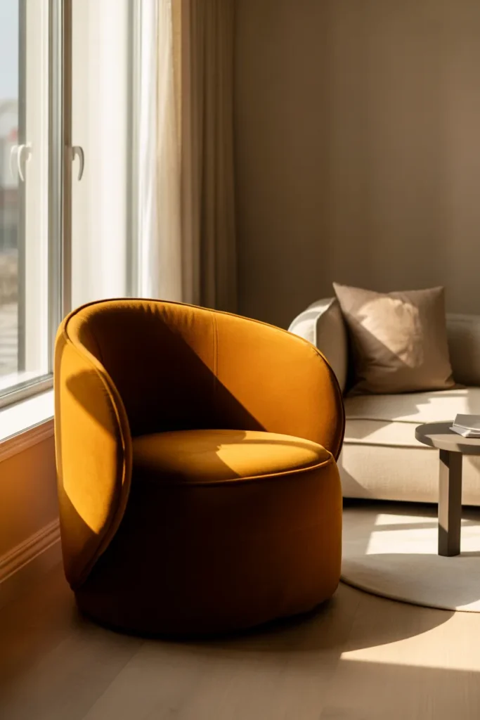
Burnt orange adds energy without feeling loud.
Use it in accent pieces like cushions, rugs, or a single chair placed near a window where natural light enhances the tone.
Best Working Ideas
- Use in accents
- Pair with neutrals
- Add natural textures
- Keep balance
21. Soft Black That Feels Modern and Chic
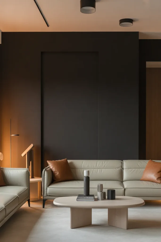
Black doesn’t have to feel harsh. A softer, matte black can feel incredibly stylish.
Use it in furniture or accent walls, paired with lighter surroundings to keep it balanced.
Best Working Ideas
- Use in moderation
- Pair with light colors
- Add warm lighting
- Keep decor minimal
22. Pale Gray That Feels Clean and Versatile
Pale gray remains a go-to, but now it’s warmer and softer.
Use it as a base and build around it with textures and subtle color accents.
Best Working Ideas
- Use as a neutral base
- Layer with textiles
- Add warm lighting
- Keep decor simple
23. Layered Neutrals That Feel Effortlessly Put Together
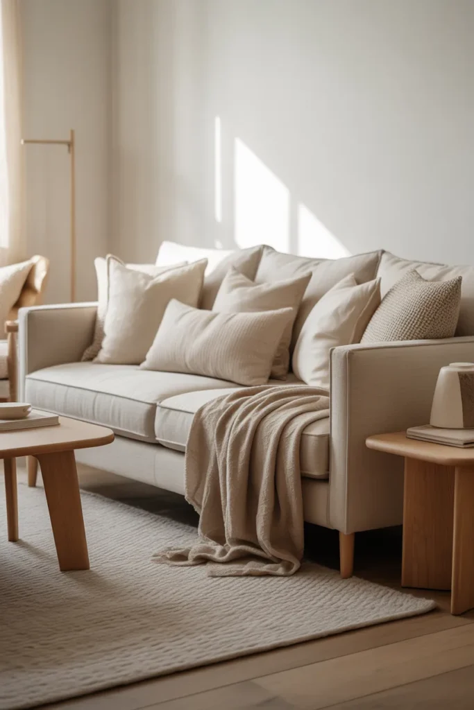
This is one of my favorites. Instead of one color, it’s about layering similar tones.
Think beige, cream, taupe, all working together. It feels calm, cohesive, and very Pinterest-worthy.
Best Working Ideas
- Mix different neutral shades
- Use varied textures
- Keep furniture simple
- Add depth with lighting
Looking for more ideas?
Check out
- Cozy Living Room Ideas for Small Spaces
- Modern Bedroom Decor Trends You’ll Love
- Minimalist Home Styling Tips
Conclusion
Trends come and go, but the way a color makes you feel, that’s what actually matters. The best part about Interior color trends 2026 is how flexible they are. You don’t need to repaint your entire home or follow every trend perfectly.
Start small. Maybe a new wall color, maybe just a few accents. Save the ideas you love, try one this weekend, and see how your space shifts.
Because honestly, sometimes all it takes is the right color to make your home feel like you again.
Quick Recap
- Soft, warm neutrals are replacing harsh tones
- Earthy colors like olive, terracotta, and brown are trending
- Muted pastels are making a subtle comeback
- Dark tones are being used more intentionally
- Layering colors is more important than bold contrasts
- Small changes can completely refresh a space