10 Bedroom Color Schemes to Transform Your Space with Style and Balance
Choosing the right color scheme for a bedroom can greatly affect the mood and comfort of the space. Different colors create different feelings, from calm and restful to bright and energizing. A well-chosen color combination can make a bedroom feel more inviting and suited to personal style.
Many people look for easy ideas that help transform their bedroom without much effort. This article explores ten popular bedroom color schemes, each offering unique vibes and practical inspiration for any style or preference.
1) Soft Gray and White for a Calm Ambiance
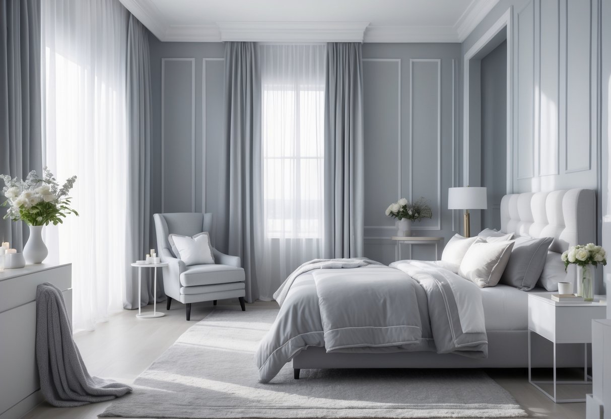
Soft gray and white create a peaceful and balanced bedroom setting. The gray adds a subtle depth, while white brightens the space, making it feel open and clean.
This color scheme works well with simple furniture and minimal decor. It helps reduce visual clutter and encourages relaxation.
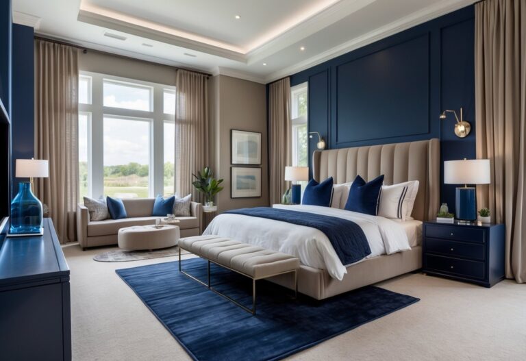
2) Navy Blue and Taupe for Elegance
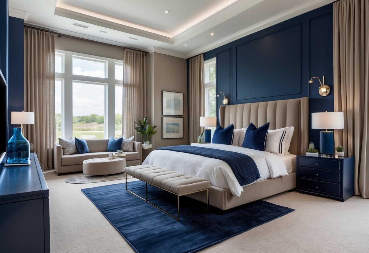
Navy blue paired with taupe creates a balanced and elegant look. The deep blue adds richness, while taupe keeps the space warm and neutral. This combination works well with wood furniture and soft fabrics to enhance comfort without overpowering the room. It suits both modern and traditional styles.
3) Warm Beige with Terracotta Accents
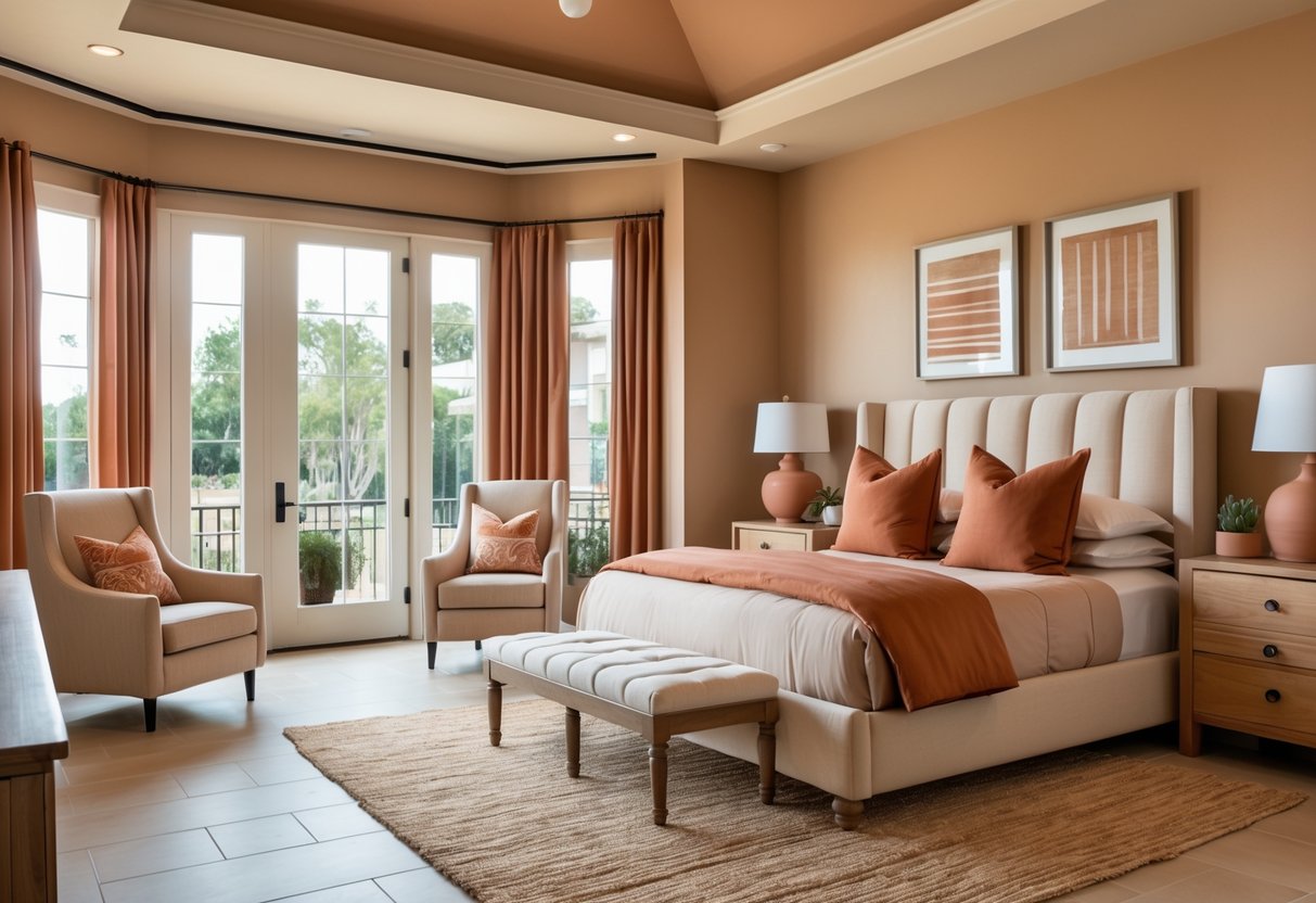
This scheme combines warm beige walls with terracotta accents in cushions or decor. The beige creates a calm, neutral base. Terracotta adds a warm, earthy touch without overwhelming the space.
Soft grey or muted greens can balance the look. The mix offers a cozy, natural feel that suits many bedroom styles.
4) Sage Green and Off-White for Freshness
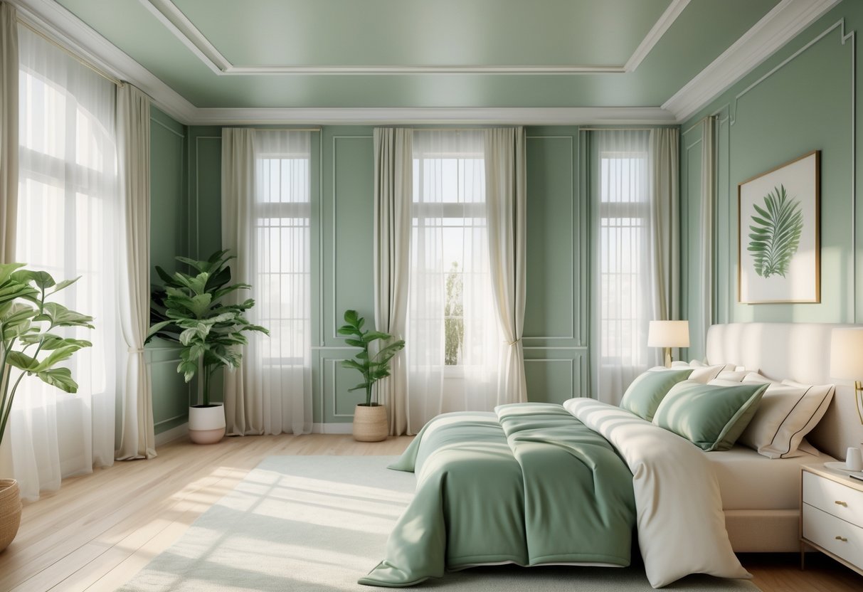
Sage green paired with off-white creates a fresh, calming atmosphere in the bedroom. The soft green adds a natural, gentle touch while the off-white brightens the space without overpowering it. This color scheme works well for those who want a peaceful, clean look that feels light and open.
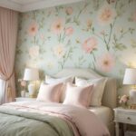
5) Dusty Rose and Cream for a Romantic Feel
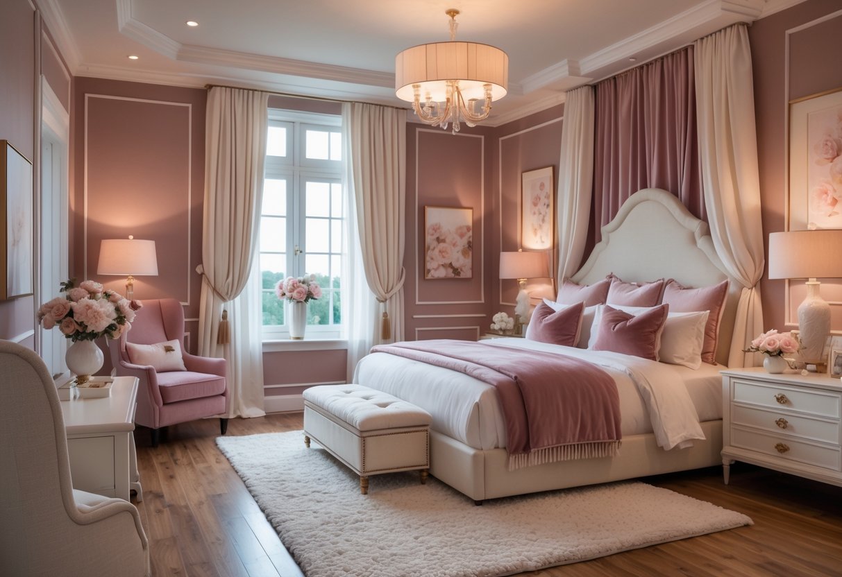
The dusty rose and cream color scheme creates a soft and calming bedroom atmosphere. It blends muted pink with a warm cream tone for a balanced and inviting look. This combination works well in bedding, walls, and decor to give the room a gentle, romantic style that is simple yet elegant.
6) Charcoal and Soft Pink for Modern Contrast
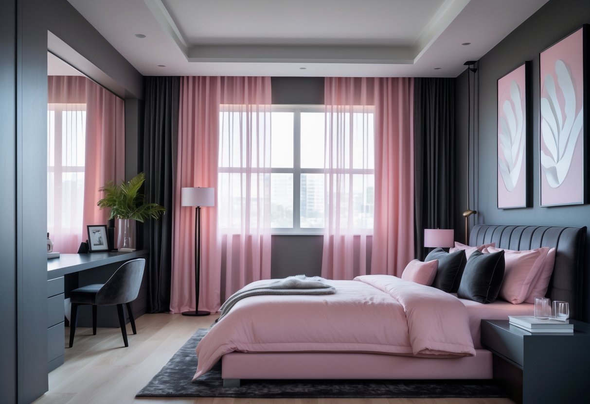
Charcoal and soft pink create a balanced look with both depth and warmth. The dark charcoal adds strength, while the soft pink brings a gentle touch.
This pairing works well in modern bedrooms, offering a stylish contrast without being too bold. It can feel both cozy and sophisticated.
7) Muted Teal and Light Gray for Serenity
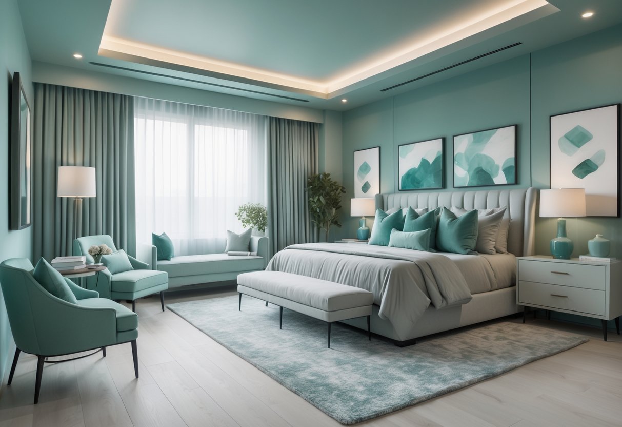
Muted teal pairs well with light gray to create a calm and soothing bedroom. This color combination feels balanced and soft without being dull.
The light gray tones provide a neutral base that lets the muted teal stand out gently. Together, they foster a peaceful atmosphere ideal for rest.
8) Rich Burgundy with Gold Details
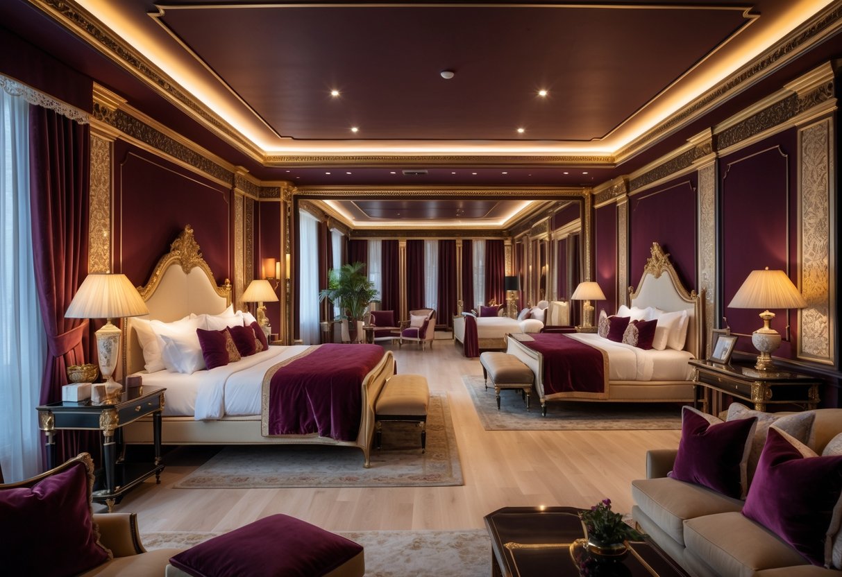
This color scheme uses deep burgundy walls paired with gold accents to create a warm and elegant atmosphere. Gold-framed artwork, lighting, and decorative pieces add a touch of luxury without overwhelming the space. The rich tones of burgundy bring depth, while gold details highlight and brighten the room subtly.
9) Pale Blue and Crisp White for Airiness
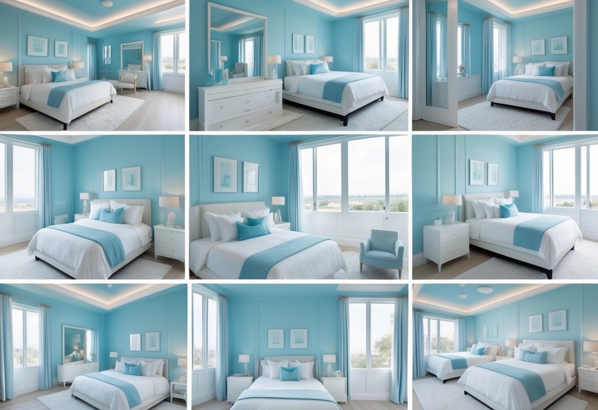
Pale blue walls paired with crisp white create a light and airy feeling in a bedroom. This combination helps brighten the space and makes it feel more open.
Adding neutral accents like beige or taupe can bring subtle depth without overpowering the calmness. This color scheme works well in both small and large rooms.
10) Deep Forest Green and Warm Neutrals
Deep forest green pairs well with warm neutrals like beige, tan, and soft browns. This mix creates a cozy and balanced bedroom atmosphere.
The rich green adds depth, while the neutrals soften the look. Together, they give the room a natural and inviting feel.
Adding natural materials like wood or plants enhances the connection to nature. This scheme suits those who want a calm but stylish space.
Fundamentals of Bedroom Color Schemes
A good bedroom color scheme depends on understanding how colors affect feelings, selecting the right undertones, and balancing accent colors with neutrals. These elements work together to shape the atmosphere and style of the room.
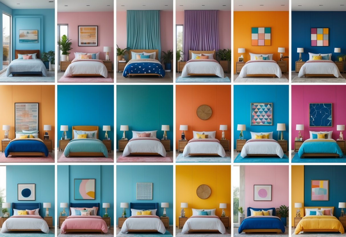
Color Psychology and Mood Effects
Colors influence mood and energy in a bedroom. Cool tones like blue and green are often used to create calm and restful spaces. Warm tones such as soft yellows or light reds can make a bedroom feel cozy and inviting.
Bright colors spark energy but should be used carefully to avoid overstimulation. Neutral colors like beige and gray offer calmness and flexibility, allowing other design elements to stand out.
Choosing colors with the mood in mind helps to create a space that supports relaxation or activity, depending on personal needs.
Choosing the Right Undertones
Undertones are subtle colors that show beneath the main shade and affect how a color looks in different lighting. For example, a gray paint might have cool blue undertones or warm brown undertones.
Knowing the undertones can prevent mismatched colors and make sure the color works well with furniture and flooring. It also helps avoid colors that look dull or too harsh in natural or artificial light.
Testing paint samples under various light sources before buying is important to identify the undertones accurately.
Balancing Accent and Neutral Colors
Balancing accent colors with neutrals creates harmony and prevents a bedroom from feeling overwhelming or dull. Neutrals like white, cream, or gray cover larger surfaces, while accent colors add interest on walls, pillows, or accessories.
A common method is the 60-30-10 rule:
- 60% neutral base
- 30% secondary color
- 10% accent color
This mix ensures that colors complement each other without clashing or dominating. Proper balance can highlight favorite colors or artwork, while maintaining a restful environment.
Tips for Coordinating Bedroom Decor
Coordinating bedroom decor requires careful attention to color harmony and texture. Selecting colors that complement furniture and choosing textiles and accessories that enhance the color scheme will create a unified and inviting space. Thoughtful choices prevent clashing tones and ensure balance throughout the room.
Matching Colors With Furniture
When matching colors with furniture, it is important to consider the furniture’s material and finish first. Wood tones, for example, look best with colors that either contrast softly or blend in naturally. Warm wood pairs well with earthy hues like beige, terracotta, or olive green.
Furniture with neutral finishes, such as white or gray, allows more flexibility in wall and decor color choices. Bold or dark furniture needs lighter or muted wall colors to prevent the room from feeling heavy.
Using a color wheel helps pick complementary or analogous colors that make furniture stand out. Avoid matching colors exactly to prevent a monotonous look. Instead, opt for varying shades or tints within the same family for subtle coordination.
Textiles and Accessories Alignment
Textiles and accessories should echo the core color scheme to support visual consistency. Bedding, curtains, and rugs can introduce different textures but must harmonize with the main colors of walls and furniture.
Incorporate patterns that combine two or more colors from the room’s palette. This connects elements without overwhelming the eye. Accessories like throw pillows or lampshades can be in accent colors to add interest but should not dominate.
A practical step is to create a simple color chart with key tones and apply it when selecting textiles. This helps avoid random choices and keeps the atmosphere balanced. Mixing soft and bold fabrics in aligned colors adds depth and comfort to the bedroom.